The 10 Best Batman Redesigns That Reimagined the Dark Knight
Throughout DC’s long history, Batman has remained one of the most iconic superheroes who
propelled them through the Golden Years. Although his design has remained one of the most
recognisable over the years, it has never been static. Ever since his debut in Detective Comics
27 (1939), the ever-tortured Dark Knight has been redesigned several times, with each
change reflecting the era’s artistic trends, audience demands, or storytelling interpretations of
the character. Whether in comics, animation, film, or video games, Batman’s evolving look
has kept him fresh and relevant.
Some redesigns emphasized practicality, favoring armor and protection Batman needs in his
line of work, while others leaned into a more stylish version of the Crusader. From his early
outer-underwear costume to the futuristic takes we have today, each new look has brought
something unique to the dark protector.
- Batman (1939 Original Design – Detective Comics #27)
Batman’s very first first costume, created by Bob Kane and Bill Finger remains one of his
most unforgettable looks. The original design set the foundation for the hero’s look but still
has many differences from later versions.
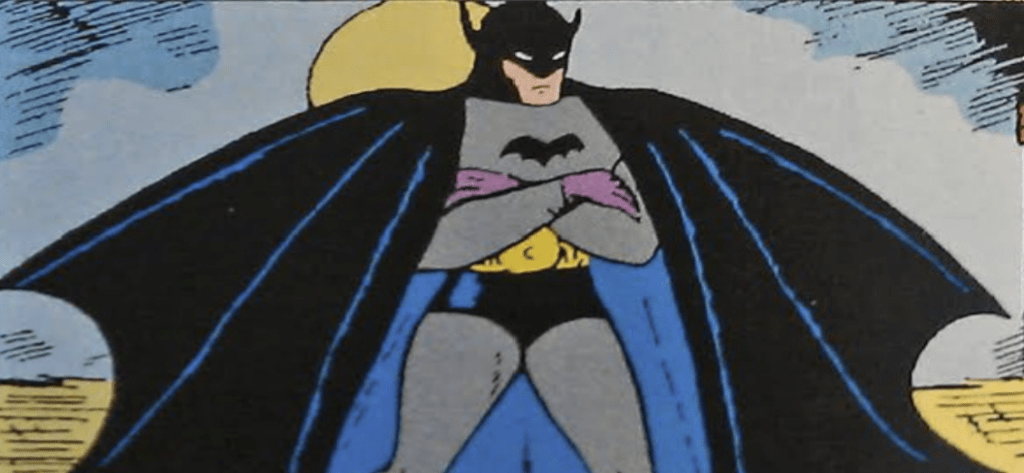
In this issue, Batman sported stuff bat wings instead of a cape, purple gloves, and an overall
pulpy design inspired by noir vigilantes like The Shadow. This early version was simple but
effective, laying the groundwork for future changes.
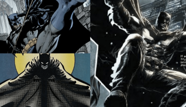
- The Dark Knight Returns (1986)
In 1986’s The Dark Knight Returns, Frank Miller transformed Batman into the menacing,
battle-weary vigilante we know today. This version sported a more human design, with
shorter ears and a more rugged aesthetic.
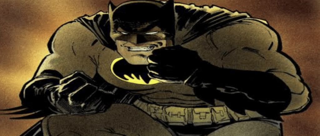
The Batsuit abandoned the traditional yellow oval for a massive black Bat symbol stretched
across its length that reflected a darker, angrier Bruce blending into the dark. The sheer
presence of this Batman represented a Bruce Wayne who relied on brute force as much as
intelligence, making this one if his most imposing versions ever.
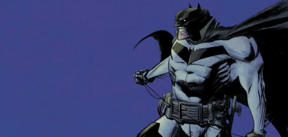
- Batman: Year One (1987)
In Batman: Year One, David Mazzucchelli redesigned Batman to be more grounded, with a
minimalist aesthetic. The suit was heavily inspired by the Golden Age Batman design, with a
simple gray palette, eschewing all frills. The artist imagined the suit with a black Bat symbol
without an oval, and a classic utility belt.
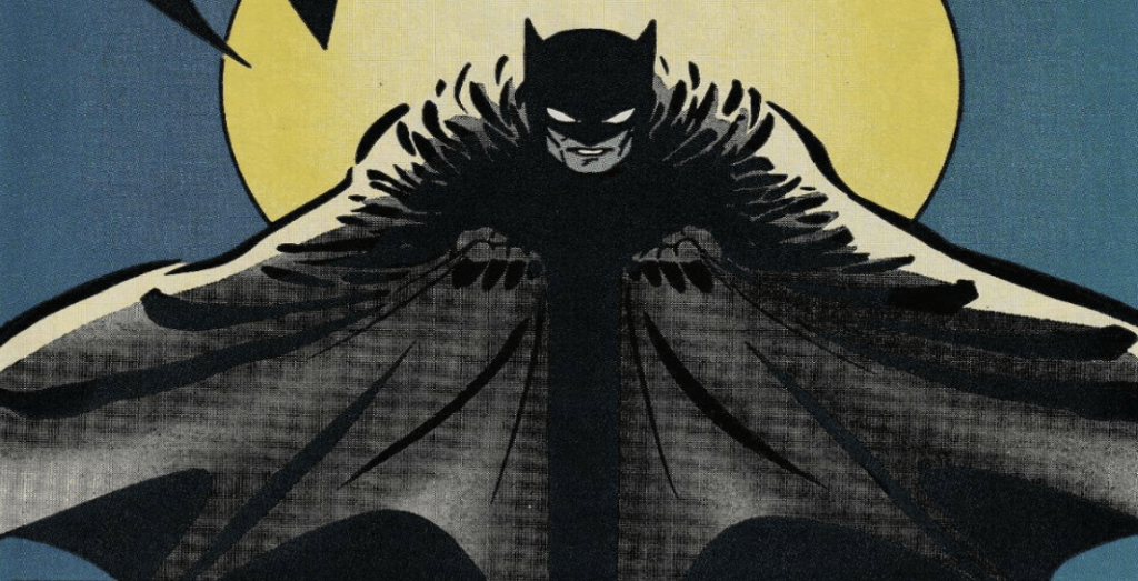
It fit the raw, early crime-fighting days of Bruce Wayne, highlighting his inexperience and
street-level approach. This look became the blueprint for many modern “Year One” Batman
interpretations.
- Knightfall Batman (1993 – Azrael’s Batman)
Jean-Paul Valley (Azrael) took up the mantle of Batman during the events of Knightfall, thus
introducing one of the most radical designs of the Dark Knight ever.
This version ditched the cape and cowl in favour of a heavily armoured tech exosuit with
sharp edges, retractable claws, and most controversial, gold-and-blue highlights.
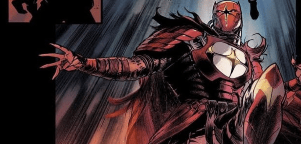
This extreme overhaul showcased a brutal, militarized Batman, emphasizing Azrael’s stark
contrast to Bruce Wayne’s methodical crime-fighting.
- Batman: Zero Year (2013)
Scott Snyder and Greg Capullo’s Zero Year arc gave us a bold reimagining of Batman’s
earliest days. Instead of the usual dark tones, this Batman sported a more survivalist-inspired
look, complete with a purple jacket, combat boots, and an overall stripped-down aesthetic.
This design captured a raw, improvisational Bruce Wayne, making it one of the most
unconventional but intriguing redesigns in modern Batman comics.
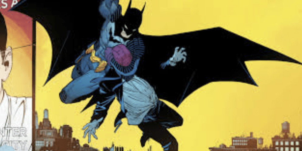
- Batman: Hush (2002)
Jim Lee’s Batman: Hush redesign became one of Batman’s most influential modern looks.
This looks featured a sleek, more intricate Batsuit with detailed shading and a refined
silhouette.
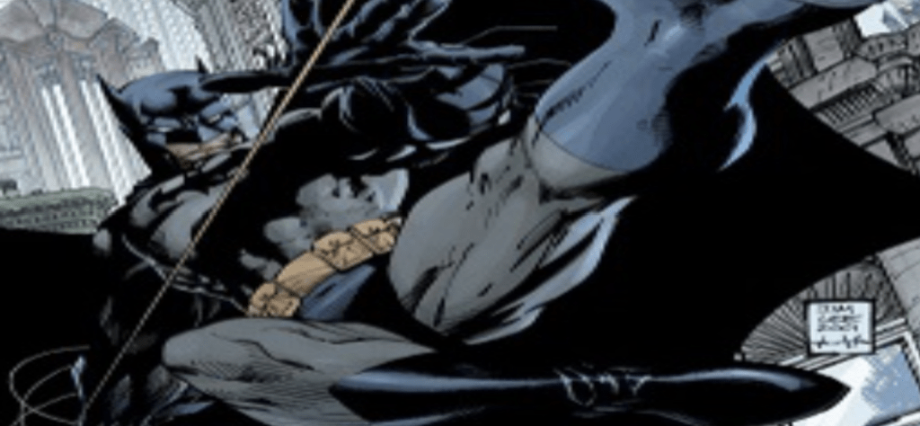
The dark blue cape and cowl, paired with a bold black oval-less Bat-symbol, emphasized
Batman’s physicality and detective skills. The entire look created an intimidating yet elegant
fan favorite.
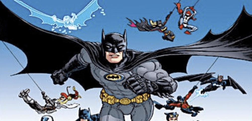
- Batman: The New 52 (2011)
Greg Capullo took over Batman’s redesign with the conception of DC’s New 52 reboot. The
dark hero received a modern, tactical look that featured a more streamlined Bat-symbol,
segmented armour plating, and subtle yet effective tech enhancements.

This new design found a balance between realism and comic stylist, and would later go on to
influence later versions in both film and animation. It was the perfect, fresh take on the Caped
Crusader for the start of a new era, while remaining familiar.
- Batman: Noel (2011)
In the same year as the New 52 reboot, Lee Bermejo’s Batman presented an ultra-detailed,
cinematic feel to Batman’s design.
This version imagined the fighter as more of a battle-worn warrior than a traditional
superhero. The high collar and hyper-realistic detailing made this one of the more visually
striking designs.
- Batman: White Knight (2017)
In Batman: White Knight, the hero was given a fresh look while keeping his classic essence
intact. Sean Murphy imagined a sleeker suit with minimalist aesthetics but sleek, sharp edges.
The effect was a high collar and slimmer profile that made Batman look more like a shadowy
urban legend, much like the noir detectives of the past.
- Batman Incorporated (2010)
When Bruce Wayne expanded his mission globally in Batman Incorporated, his suit got a
subtle but meaningful redesign. David Finch’s version maintained the black-and-gray color
scheme but added a yellow-outlined Bat-symbol reminiscent of his classic Silver Age look.
This design blended modern sensibilities with a heavy nod to Batman’s past, making it a
great full-circle moment for the character at that time.